The Best Squarespace Template for Artists Who Need a Website Quick!
The Squarespace Keo template is one of the best out-of-the-box options for artist portfolio websites, and probably my top recommendation in general for the best Squarespace template for artists. It's clean, professional, and gets you 90% of the way there without any custom coding. But with a few strategic tweaks, you can transform it from good to exceptional in a day.
I'm Christina Balch, and I specialize in artist websites. In this guide, I'll walk you through exactly how to optimize the Keo template for your artist website—focusing on the changes that make the biggest impact.
For a video guide on how to use Keo for your artist website, check out my YouTube video
To see other Squarespace templates I like for artist websites, read Best Squarespace Templates for Fine Artists in 2025
What I Cover
Adding a contact page and additional navigation
Removing unnecessary elements from the header
Customizing your homepage presentation
Fixing the work landing page (this is the big one)
Optimizing project pages for better user experience
(affiliate link)
Getting Started
Once you've selected the Keo template in your Squarespace account, navigate to Website → Pages and hit Edit to begin customizing.
Header Optimization
Your Site Title
The demo puts "Artist Website Demo" in the top left corner. Replace this with your name, pseudonym or studio name. Simple, but crucial for both user experience and SEO—people searching for you on Google need to see your name somewhere on the page.
Remove the Email Icon
The template includes an email icon in the header social links. Delete it. A dedicated contact page is far more professional and functional than a header email link.
Add a Contact Page
Navigate to your pages panel and add a new contact page. This gives visitors a proper way to reach you and looks more professional than a mailto link.
Social Links
Only include social media accounts that are:
Active and regularly updated
Specifically related to your art practice
Not just personal content
If you don't have art-specific social accounts, delete the social links entirely and move your navigation links to the right side of the header for a cleaner look.
Get Started with Keo on Squarespace (affiliate link)
Homepage Strategy
The Opening Statement
The Keo template includes large text at the top of the homepage. This is valuable real estate. Use it to immediately communicate who you are and what you do—ideally in one sentence or just a few words.
For example: "Multidisciplinary studio of [Your Name]" or "Installation artist exploring [theme]."
Pro tip: If your site title isn't just your name, make sure your actual name appears somewhere prominently on the homepage. This helps visitors confirm they're on the right site and improves your search engine visibility.
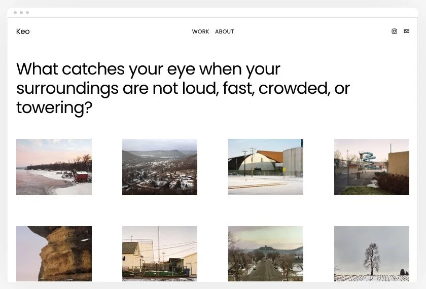
Image Gallery Options
The default template uses a grid gallery with multiple images. I recommend one of two approaches:
Option 1: Larger, Fewer Images
Edit the gallery section and reduce the columns to 2 or 3. This makes your work bigger and easier to see. With larger images, limit yourself to 4-6 pieces rather than filling the entire grid.
Option 2: Single Hero Image
Delete the gallery entirely and add one large image or video. This creates maximum impact and works especially well if you have one standout piece.
Option 3: Featured Project Links
Instead of a lightbox gallery, add 2 image blocks side by side. Link each image to a full project page rather than just opening a larger version. This gives visitors more context and creates a more sophisticated browsing experience.
I personally prefer Option 3—it feels more intentional and guides visitors through your work more effectively.
The Work Landing Page: My Biggest Recommendation
This is the most important change you'll make to the Keo template, and it’s probably a lot simpler than you think to change.
This image hover function on the Keo template is not a good user experience so I recommend changing it to a simpler hover state. Usually, simpler is better for websites.
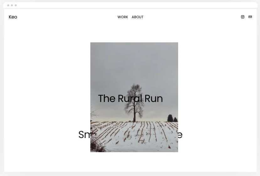
The Problem with Hover-Follow Cursor
The default work page uses a "hover-follow cursor" effect where images follow your mouse. It's visually interesting but creates usability issues:
Text becomes unreadable when images appear
It's not intuitive for all users
It violates website best practices
The Solution: Simple Grid
Navigate to your Work page and click Edit Section
Find the Hover dropdown
Change from "Follow Cursor" to "Simple Grid"
This displays a clean grid with a hero image for each project and the project title underneath. Users click the image or title to view the full project page.
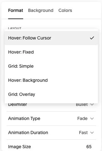
Choose “Grid: Simple” instead of Hover options
Customize Your Grid Layout
Columns: Set to 2 columns for 4 projects (keeps things even)
Height: Use full height or custom depending on your images
Spacing: Increase both horizontal and vertical spacing to give images breathing room
Text Alignment: Left alignment is cleanest, center alignment is okay too
Background: Keep it white or very minimal—let your artwork be the focus

This is a much better experience for people visiting your website.
(affiliate link)
Project Page Best Practices
Organization
You can organize projects by:
Individual project titles (works well for thematic bodies of work)
Artwork type (painting, sculpture, installation, etc.)
Series or collections
Use whatever makes the most sense for your practice.
Project Descriptions
Each project page has space for a title and description. Use this opportunity to:
Provide context for the work
Explain your process or inspiration
Share technical details
Speak in your own voice
You can include as much or as little text as you want, but having some description helps viewers connect with your work.
Image Layout Considerations
For vertical images: Don't let them span the full width of the page. Desktop users won't be able to see the entire image without scrolling. Instead:
Add padding on either side
Left-align the image with space on the right
Center the image with even spacing
For multiple images: If you want images side by side, make sure the accompanying text describes them as a series or group—not individual descriptions for each image. Otherwise, stack images vertically.
Consistency is key: Whatever layout approach you choose (left-aligned, centered, etc.), maintain it across all project pages. This creates a cohesive user experience.
Additional Elements
The Ticker Text
The template includes a scrolling text element that says things like "currently shooting in the south." This is optional but can be engaging if you:
Have current news to share (exhibitions, residencies, collaborations)
Keep it updated regularly
Want to highlight what you're working on right now
If you're not going to maintain it, delete it entirely.
Footer Customization
The footer displays your name in very large text. If this works for you, keep it. If not, make it smaller.
Important: Remove "Made with Squarespace" from the footer and replace it with a copyright notice:
© [Year] [Your Name or Studio Name]
This protects your images (in theory, consult a lawyer if you’re really concerned about this) and looks more professional.
Final Thoughts
The Keo template is genuinely excellent for artists right out of the box. These modifications—especially changing the work landing page from hover-follow to simple grid—will give you a portfolio site that's both beautiful and functional.
The best part? You can implement all of these changes without touching a single line of code.
Start Your Squarespace Artist Portfolio with Keo Today (affiliate link)
Want to go further?
If this post was useful, The Artist Website Course is the next step — it's free, on-demand, and built specifically for contemporary multidisciplinary artists. Chapter 1 is available now and covers the strategy side of things before you touch a single template.
If you'd rather work through it with someone, I also offer 1:1 website coaching for artists who want personalized support.